
| |
|
|
| 首页 淘股吧 股票涨跌实时统计 涨停板选股 股票入门 股票书籍 股票问答 分时图选股 跌停板选股 K线图选股 成交量选股 [平安银行] |
| 股市论谈 均线选股 趋势线选股 筹码理论 波浪理论 缠论 MACD指标 KDJ指标 BOLL指标 RSI指标 炒股基础知识 炒股故事 |
| 商业财经 科技知识 汽车百科 工程技术 自然科学 家居生活 设计艺术 财经视频 游戏-- |
| 天天财汇 -> 设计艺术 -> 纯html5+css能写出什么惊人的效果? -> 正文阅读 |
|
|
[设计艺术]纯html5+css能写出什么惊人的效果? |
| [收藏本文] 【下载本文】 |
|
鄙人最近学习css,发现纯html5+css可以实现这般效果: 一棵跳舞的树 纯HTML5+CSS3实现一棵自己跳舞的树 [图片] 想请大家晒一下自己… |
|
|
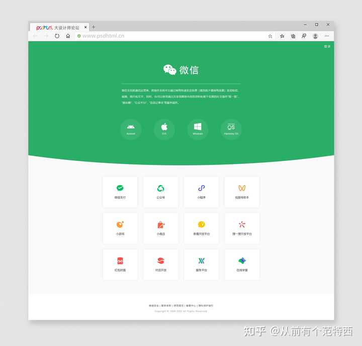
微信官网仿写 ↑ |
|
|
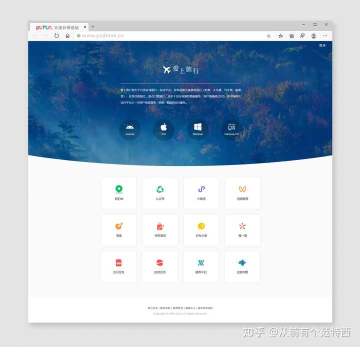
将这个版式换成旅行网站主题后 ↑ |

|
|
移动端响应式效果 ↑ 微信官网首页,简约干净,能学习写好这个首页,就能掌 握HTML网页设计前端盒子的布局、嵌套,及css效果的 使用... 微信官网首页主要有以下几个需要关注的点: 1. 通过@media写需要适应PC、手机版的部分盒子的 css,将PC版的固定尺寸改为移动端的宽度百分比从而做到“响应式”; 2. space around的应用,可以使弹性布局盒子内部(横轴)方向上均匀排列每个元素; 3.鼠标划过小手标志,运用cursor: pointer; 4.hover的应用,鼠标滑过可改变背景色; 5.鼠标划过盒子缩放1.2倍,增加过渡时间让动画缓入更 加舒适; 6.本套源码已共享在下方,预览及讲解视频请查看:https://www.zhihu.com/zvideo/1497705066815086592 更新:【禁止商用】发现有很多开发者拿这套源码去部署建站,在不同的测试服务器、域名中上线测试,再次强调,仅供学习,禁止商用,如造成侵权行为后果自负~ 你都能部署到服务器就不能自己写一套吗?/滑稽 【更多相关可以查看下方我的网页设计源码专栏 ↓】 |
|
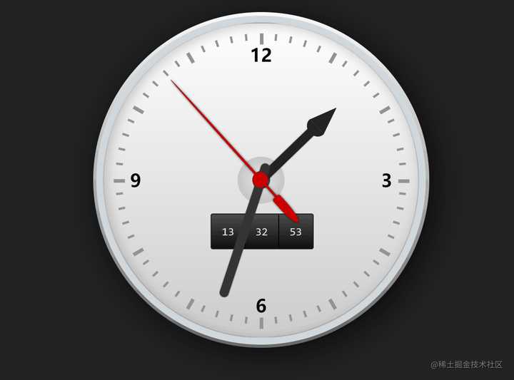
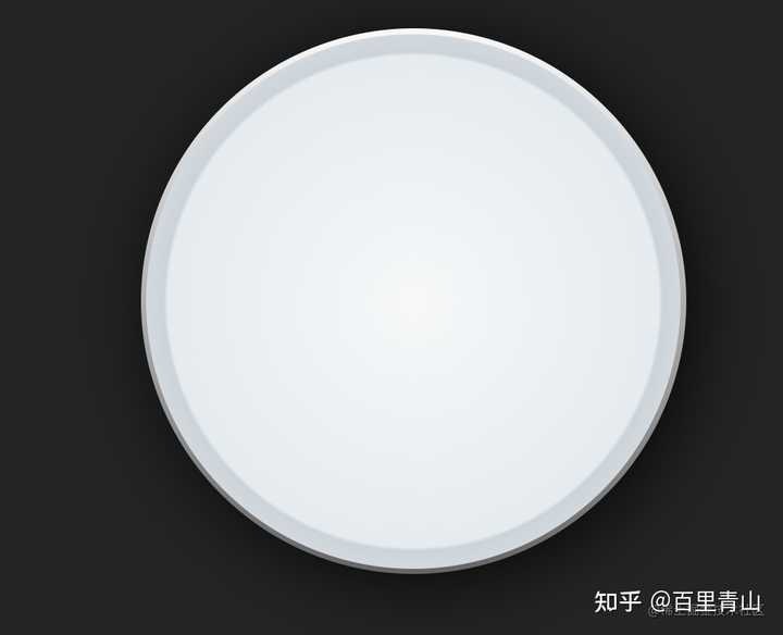
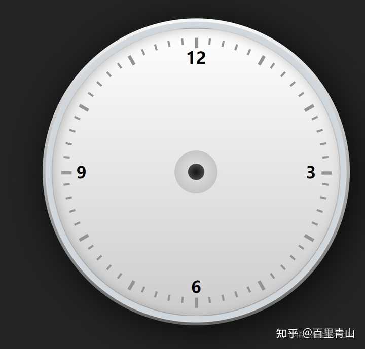
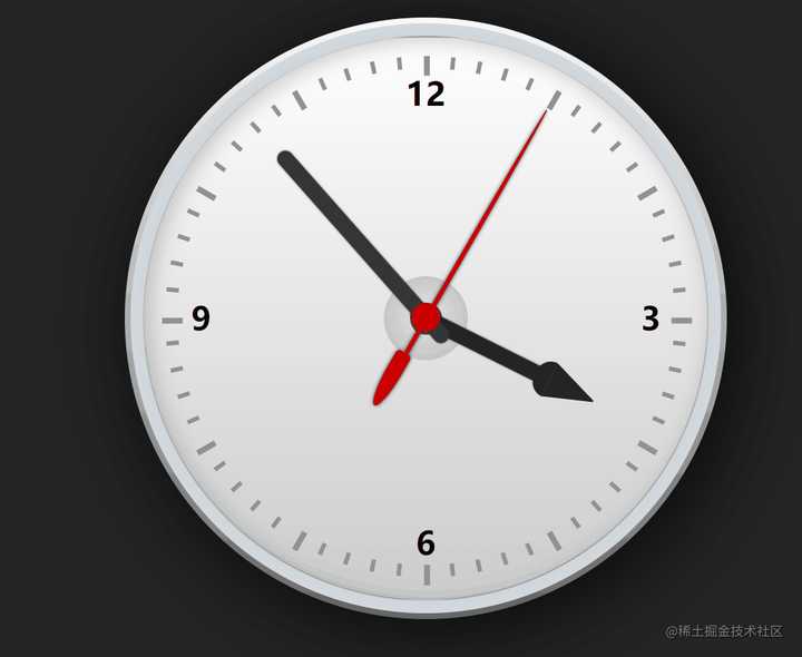
前言 前两天翻资料,找到了刚开始学习前端的时候学习的一个小案例,用css去画一个转动的表盘,也不知道大家都写过没有,样子如下图所示 |
|
|
今天把这个小案例分享给大家,这个效果原案例是完全用css实现的,因为表针转动都有规律可循,设置一个定时的动画就行,我为了简化代码量,并且可以获取当前的时间,所以用js优化了一下,因为案例很小,所以就不用框架了,直接原生走起,由于这种简单的文章主要面向初学者,所以会说的详细一点 开发初始化 第一步,找一个文件夹,建立 index.html , 然后引入一个 style.css 并初始化一些样式 |

|
|
表盘制作 接下来我们来制作表盘 面板 首先是面板部分,面板的html部分我们就只用一个节点就够了,其他都用css来完成 首先我们给表盘一个基础样式来确定基本结构,再加点渐变和阴影,制造一点立体感 |
|
|
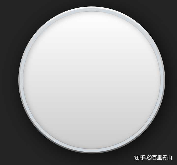
之后我们利用伪类元素,画一个径向渐变,来营造一个层次感,让表盘的立体感更加强烈 |
|
|
这样看着还是不太顺眼,我们再加一个伪类,制作变盘的主面板,通过阴影和渐变造成的对比效果,让这个表盘看起来更真实 |
|
|
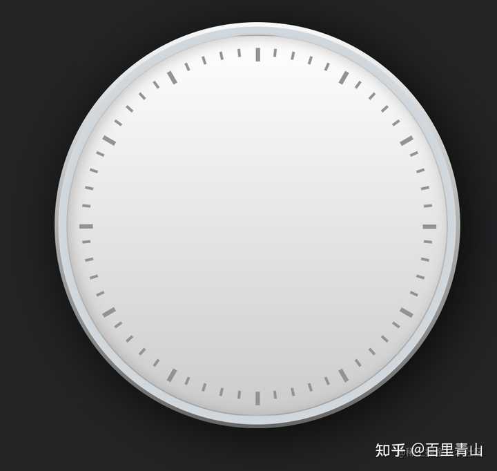
刻度 表盘的周围有一个个的小刻度点,让我们可以知道现在的具体时间,这里我们给表盘设置60个刻度点,dom节点我们先写一个刻度点的容器,因为刻度点太多了,我们稍后用js生成 来一个基础的样式 这里我们通过 transform 调整每个刻度点的位置达成相应的效果,整点的刻度相比其他的要更突出,所以我们要找出整点的刻度给他加一个突出的效果 |
|
|
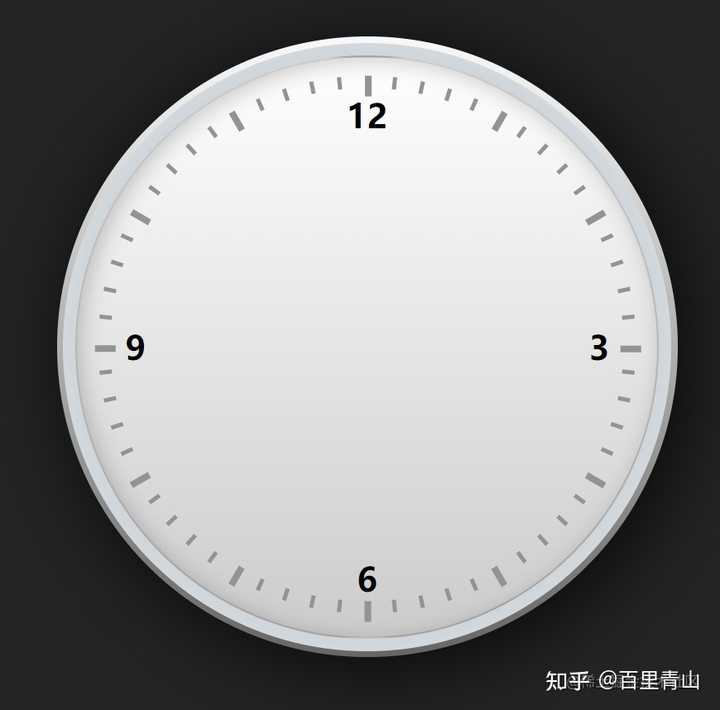
这里我们也可以酌情考虑增加一些刻度的数字标识 |
|
|
这里我们直接把指针转动的轴中心点也给做上 |
|
|
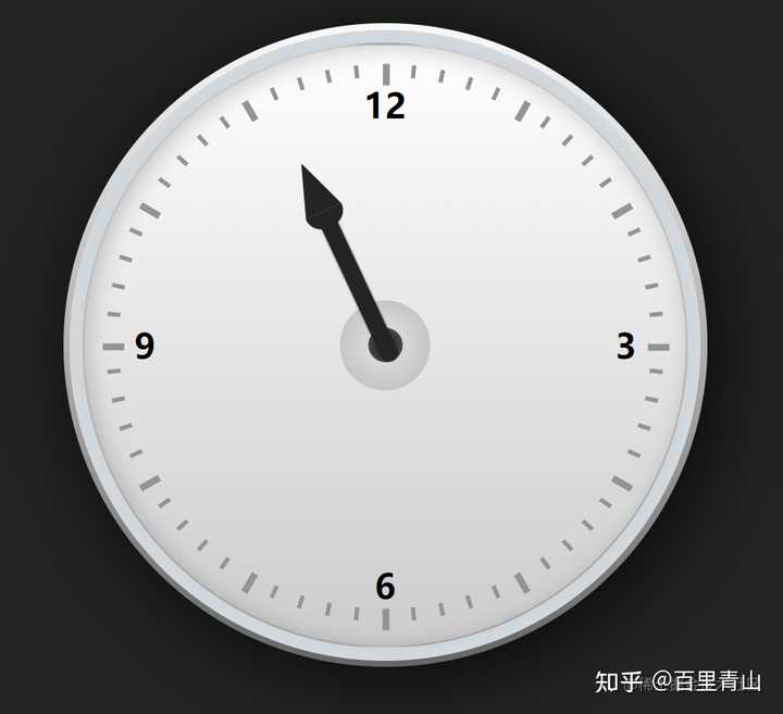
指针开发 接下来我们进行表盘指针的开发 指针这里我们给准备三个dom,分别是时针、分针和秒针 时针开发 时针主体部分分为针柱和针尖,针柱方面就一个矩形,针尖可以用一个半圆和一个三角形组成 |
|
|
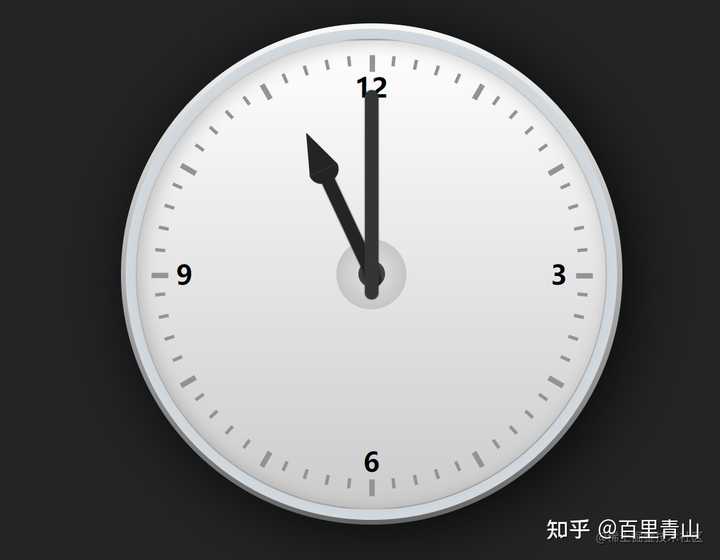
注意,这里我们用了 transform-origin 这个属性,这个属性是用来设置rotate旋转基准点的,dom旋转的时候将会以这个点进行旋转,如果不设置的话将会以自身中心点位中心旋转 分针开发 为了做一个区分,我们不同的指针给一个不同的样式,分针的话就一个矩形就行 |
|
|
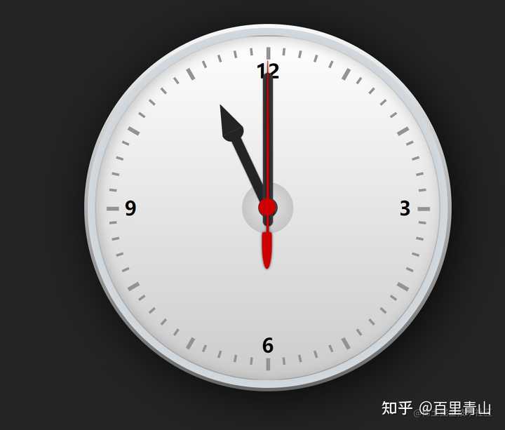
秒针开发 秒针由三部分组成,分别是针尾的圆角矩形,一个和中心点重叠的圆形,还有一个很长的针尖,也可以通过圆角来做 |
|
|
让针转动起来 上面我们开发了表盘和指针的基本样式,下面我们就让针来转动起来,刚才写css的时候,我们已经知道了,指针的位置是通过transform转动了一定的角度来实现的,所以我们要实现指针的运动,只要定时去改动这个角度就可以了 这样就大功告成了 |
|
|
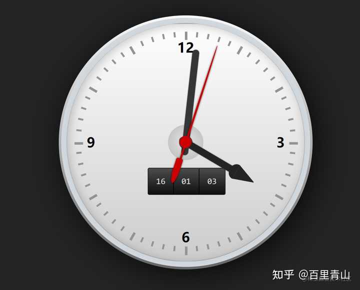
数字表开发 指针虽然也很直观,但总是没有数字直观准确,所以我们可以再加一个数字小表盘。数字表盘更简单了,我们获取一下当前的时分秒,定时刷新就好了,这里需要主机柱子表盘放的层级,不可盖住指针 |
|
|
这样就大功告成了。 |
|
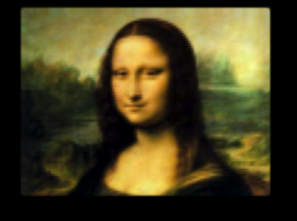
只用css能玩出什么花样? - 逝者如斯的回答 >>>>>>>>>>>>>>>>>>>>>>2016.2.11一更<<<<<<<<<<<<<<<<<<<<<<<<<<< 可以看看这个回答,30种濒危动物那个就做的挺好的 先不说3d效果,就论一个平面上的话, 只用一行div,无js,就可以画一幅世界名画蒙娜丽莎,CSS博大精深→ _→ Mona Lisa with pure CSS |
|
|
虽然作者不是手写的,但至少另一个角度说明css可以做到这样的效果,画画不只有canvas,svg等。。。 下面有小伙伴提到了刚出来时很火的“纯CSS技术画出30个濒危动物图片”,这里一并列出并给出网址, “30个物种,30中碎片拼图。”点开这场展览的网站主页,空灵的背景音乐引入了颜色饱满的多边形图案,配合着30种濒危动物的文字介绍。而之所以叫“30片三角”,是因为James起初在摆弄编程的时候,第一幅成型的作品“夏威夷乌鸦”,刚刚好是30片三角形拼接而成。 但这次展览拼的不是技术或着艺术。伴随30只生命样貌的切换,一幅幅几何状组合的破碎,设计师试图展现过去10年来栖息地遭受破坏是如何把动物推向灭绝的边缘――曾是 2014 年巴西世界杯吉祥物的三带犰狳( Three-Banded Armadillo of Brazil)数量减少了 30%,新几内亚岛上的原针鼹鼠( Long-Beaked Echidna )因人类的狩猎而在过去 35-40 年间减少近 80%。 官方网址: 30个CSS碎片拼图,30种濒临灭绝动物 (官网需要fanqiang查看) 无论是背景音的选用,还是动物样貌之间的切换,抑或是细节处的动效展现,再加上主题的升华,有技术有内涵,这是一部成功的作品。 |

|
|
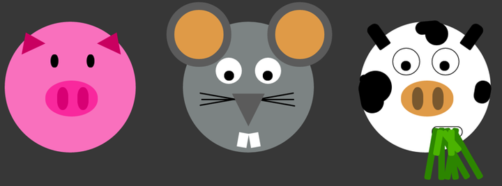
可以闲来无事画画小动物: |
|
|
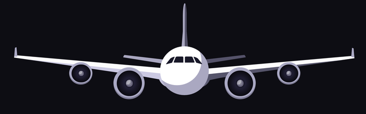
打打灰机: Airplane (Pure CSS) |
|
|
CSS Faces |

|
|
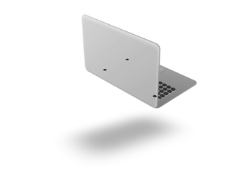
这些都是静止的,想想再加上各种动画,也可以做出很多效果出来的。 CSS3D苹果笔记本动画: 这又是一款超酷的CSS3 3D动画效果,它是一款带有3D视觉效果,并且可以360度旋转的macbook air。这款CSS3 3D动画的笔记本底部有一个逼真的投影,可以跟随图片一起转动,从而凸显其3D效果,是一款很不错的CSS3 3D动画特效 CSS3 3D 苹果笔记本动画DEMO演示 |
|
|
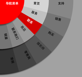
还有 CSS3扇形动画菜单DEMO演示 |
|
|
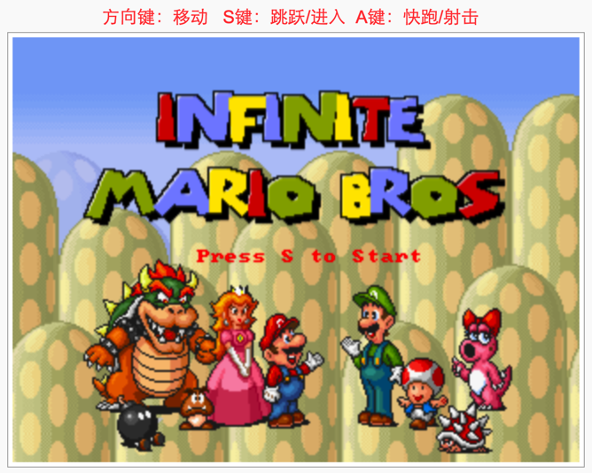
HTML5超级玛丽体验: HTML53????êà? |
|
|
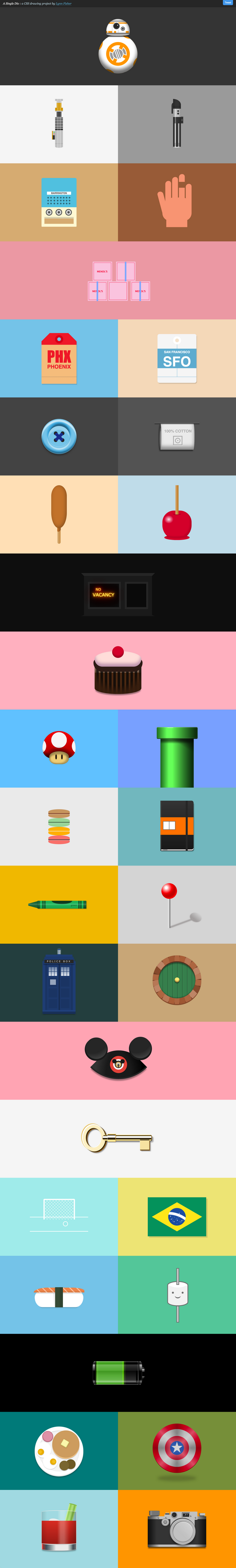
>>>>>>>>>>>>>>>>>>>>>>2016.3.5三更<<<<<<<<<<<<<<<<<<<<<<<<<<< 我们知道js在web方面能做很多事 有一句话说:限制你的可选项,会让你重新评估手头上已有的工具。 如果只让你用css,能完成某项任务吗?而这个任务中,只用一个div,全靠css属性来实现效果,可以吗? 可以看看翻译的一篇 基于单个 Div 的 CSS 绘图 - 前端外刊评论 - 知乎专栏: “为了得到更大的挑战,探索 CSS 的潜力,我给自己定了这个限制,只是用一个 Div。不能直接买一只绿色的笔(添加更多的 Div),我要做的就是尽其所能地结合 CSS 属性来实现我的目的。” 以下这些都是基于一个div所做的: A Single Div |
|
|
>>>>>>>>>>>>>>>>>>>>>>2016.7.12四更<<<<<<<<<<<<<<<<<<<<<<<<<<< 做一个动态的旋转木马给妹纸,立马少女心泛滥有木有(星星眼): Horse ride carousel flat design by Lina for Zajno (3D animated with CSS3) |

|
|
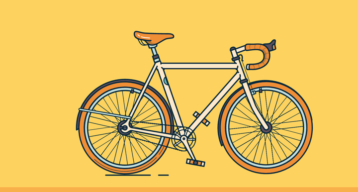
css可以用来做图像,做完图像还可以用css添加动画,能做成什么样还要看你的想象力了。再加上合适的主题,就能做出一件成功的作品。 还有动态的车子: Bike Season |
|
|
上面两个例子来自can you code this ui https://stories.uplabs.com/can-you-code-this-ui-4530315290a1#.65da2m9rs css可以用来做图像,做完图像还可以用css添加动画,能做成什么样还要看你的想象力了。再加上合适的主题,就能做出一件成功的作品。 |
|
老鱼带你来欣赏纯CSS实现的特效有哪些! CSS是一门很特殊的语言,你认为CSS只能用来控制网页的结构与样式,但只要你有丰富的想象力,就能创造无限可能。 我精选5个使用纯CSS实现的文字炫酷效果! 效果欣赏一. 渐变文字效果 该效果主要利用background-clip:text配合color实现渐变文字效果 首先了解background-clip: text;的意思:以盒子内的文字作为裁剪区域向外裁剪,文字之外的区域都将被裁剪掉。 |

|
二.彩虹文字效果(跑马灯) 该效果也是利用background-clip:text和线性渐变属性linear-gradient实现,通过设置区域颜色值实现了彩虹文字的效果。 |

|
三. 发光文字效果 该效果主要利用text-shadow属性实现。text-shadow属性向文本添加一个或多个阴影。该属性是逗号分隔的阴影列表,每个阴影有两个或三个长度值和一个可选的颜色值进行规定。 |

|
四.打字机效果 该效果主要是通过改变容器的宽度实现的。 |

|
五.故障风格文字效果 该动画效果比较复杂,主要用到了CSS伪元素、元素自定义属性、蒙版属性、animation动画等等,但就是没有JS~ |

|
具体实现可以看这篇文章~ 2021年12月9日更新 没想到评论和私信好多人跟我要源码... 因为CSS animation动画代码有点长就没全放出来,这里给大家附上Sample链接! 最后再送上一份CSS架构系统精讲视频 你是否觉得自己写出来的CSS 代码臃肿、难维护、难复用? 一个好的 CSS 架构是具有良好的可扩展性 |

|
|
我是老鱼,一名致力于在技术道路上的终身学习者、实践者、分享者! 如果我的内容能对你有所帮助,关注 @前端实验室 跟我一起学习~ 一个赞同和喜欢鼓励一下下~ |
|
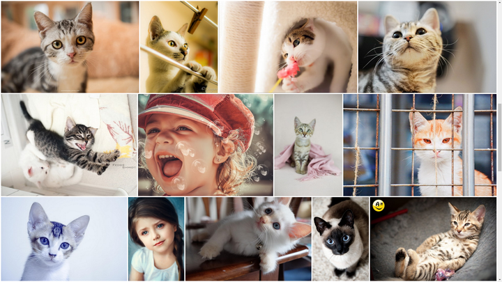
贴个自己做的: Cats |
|
|
用纯CSS实现图片的即不变形拉伸,同时又占满容器宽度的布局。 几乎所有的网站在实现这样的布局时都是使用JS计算实现,我在最早看到这种布局时也是觉得CSS没办法实现这样的布局,直到我看了《CSS Secrets》这本书,开始思考能否用纯CSS实现这种布局,没有想到最终真的只用CSS做出来了。如果想了解具体如何实现可以阅读我博客的文章: 使用纯 CSS 实现 Google Photos 照片列表布局 ・ Issue #4 ・ xieranmaya/blog ・ GitHub |
|
|
| [收藏本文] 【下载本文】 |
| 上一篇文章 查看所有文章 |
|
|
|
| 股票涨跌实时统计 涨停板选股 分时图选股 跌停板选股 K线图选股 成交量选股 均线选股 趋势线选股 筹码理论 波浪理论 缠论 MACD指标 KDJ指标 BOLL指标 RSI指标 炒股基础知识 炒股故事 |
| 网站联系: qq:121756557 email:121756557@qq.com 天天财汇 |